How Good Website Design Can Transform Your Brand’s Online Presence
Your website is usually the first thing a potential customer sees. Before they read a word, they’ve already formed an opinion. Research from Google suggests it takes less than a second. That’s not a lot of time to make your case.
So what separates a website that converts visitors into customers from one that sends them straight to a competitor? It comes down to a handful of design decisions — most of which have nothing to do with making things “look pretty.”
Why First Impressions Online Are Hard to Recover From
You can run the best Google Ads campaign in your category. If the landing page feels slow, cluttered, or dated, most of that spend is wasted. Users don’t give you the benefit of the doubt. They leave.
The phrase “you never get a second chance to make a first impression” has been repeated so many times it’s almost lost its weight — but online, it’s literally true. There’s no follow-up conversation, no second meeting. If someone bounces, they’re gone.
A well-designed website keeps people long enough to hear what you have to say.
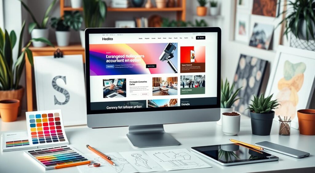
What “Professional Web Design” Actually Means
It’s not just a nice color scheme. Professional web design brings together several things at once:
- A responsive layout that works on phones, tablets, and desktops without breaking
- Consistent branding — your logo, colors, and tone should feel like one coherent thing, not a patchwork
- Navigation people can actually follow — if someone can’t find your pricing page in 10 seconds, they won’t
- Fast load times — Google penalizes slow sites in search rankings, and users abandon them even faster
- Content that’s organized logically — headings, sections, and white space that make scanning easy
These aren’t nice-to-haves. They’re table stakes.
User Experience: The Part Most Brands Get Wrong
UX is one of those terms that gets thrown around a lot. What it actually means is: can people accomplish what they came to do without getting frustrated?
A few things that matter here:
Navigation. Keep your main menu simple. If you have more than 6 items in your nav, you probably have a clarity problem, not a design problem.
Accessibility. Alt text for images, contrast ratios that work for color-blind users, keyboard navigation — these aren’t just for compliance. They expand your audience and tell people you’ve thought carefully about your product.
Mobile-first thinking. In most industries, more than half of all web traffic comes from phones. Designing for desktop first and then “making it work on mobile” is backwards. Start with the small screen, then expand up.
Information architecture. How content is organized beneath the surface matters as much as how it looks. Users follow mental models — they expect certain things in certain places. Work with those expectations, not against them.
Responsive Design Is Not Optional
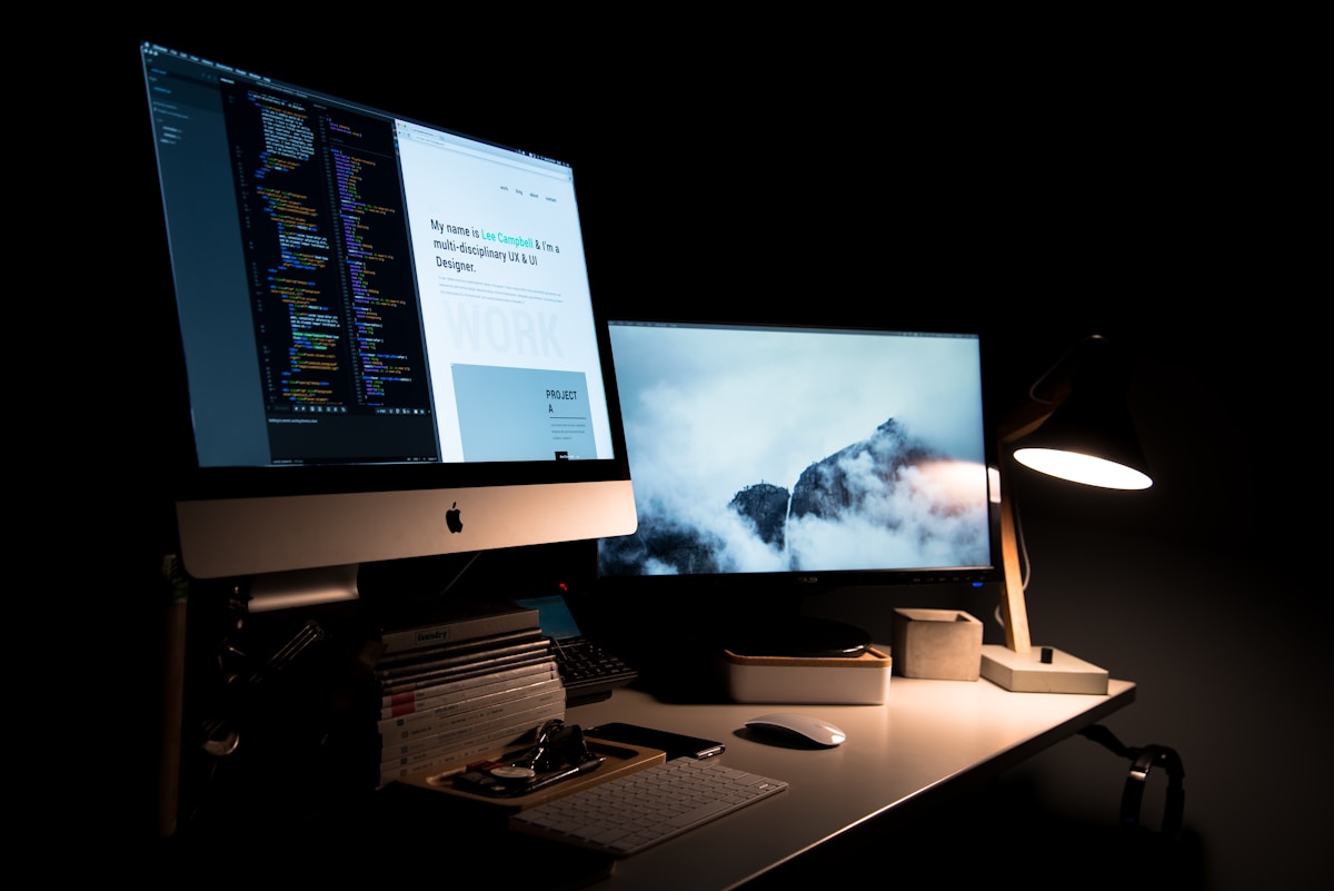 A responsive layout adjusts to any screen without losing usability or visual coherence.
A site that breaks on mobile in 2024 signals one thing: nobody’s paying attention. And if you’re not paying attention to your website, why would a customer trust you with their money?
Responsive design means your layout, images, and font sizes adapt fluidly to any screen size. A few approaches worth knowing:
- Mobile-first development — write your CSS for small screens first, then add breakpoints for larger ones
- Flexible grid systems — layouts built on relative units (percentages, rems) rather than fixed pixel widths
- Progressive web apps (PWAs) — for brands that want app-like performance without requiring an App Store download, PWAs can significantly improve load speed and offline behavior
Performance matters too. Compressing images, minifying CSS and JavaScript, and using a CDN (content delivery network) can cut load times in half. That’s a measurable difference in bounce rate.
Brand Identity Needs to Show Up in the Design
Your website is where your brand identity either lands or falls apart.
Color, typography, and imagery aren’t decorative choices — they communicate. Blue reads as trustworthy (banks, law firms, SaaS companies use it for a reason). Red creates urgency. Green sits with health, nature, and sustainability. None of this is accidental.
The same goes for fonts. A serif typeface like Playfair Display signals heritage, authority, and craft. A geometric sans-serif like DM Sans reads as modern, clean, and efficient. Using them together, as in the example below, can communicate both, as long as the pairing is intentional.
Pick your palette, pick your type family, and use them consistently. Every page. Every button. Every heading. Inconsistency is the fastest way to erode trust.
SEO and Design Are Not Separate Conversations
 Design and SEO decisions affect each other more than most people realize.
A lot of clients come to us thinking SEO is something you bolt on after the site is built. It doesn’t really work that way.
Design decisions affect SEO directly:
- Page titles and meta descriptions need to be written thoughtfully, not auto-generated
- Image alt text helps search engines understand your content and improves accessibility at the same time
- Heading hierarchy (H1, H2, H3) tells Google how your content is structured — it’s not just a visual thing
- Site speed is a ranking factor. A beautiful site that loads in 6 seconds will rank below an uglier site that loads in 1.5 seconds
- Mobile-friendliness has been a Google ranking signal since 2015
The cleanest version of this: design your site as if SEO doesn’t exist, then check that the structural decisions you made align with what search engines reward. Most good design choices already do.
The Psychology Behind Colors and Fonts
Here’s a table worth bookmarking if you’re making design decisions:
| Color | What It Communicates | Common Use Cases |
|---|---|---|
| Blue | Trust, stability, calm | Finance, legal, SaaS, healthcare |
| Red | Urgency, energy, passion | CTAs, retail sales, food |
| Green | Growth, health, sustainability | Wellness, eco brands, finance |
| Yellow | Optimism, creativity, warmth | Kids’ products, food, and education |
| Black/Gold | Luxury, authority, exclusivity | Premium services, fashion, and hospitality |
Typography carries similar weight. Use it deliberately. And don’t use more than two font families on a single site — it almost never works.
What This Looks Like in Practice
Here’s a real-world example of design choices working together. Take the ad creative below, built for Eternity Media’s paid ads service:
- Dark background with subtle grid texture creates a premium, focused feel
- Gold accent color (#D4AF37) signals high value without being loud
- A serif headline (Playfair Display) paired with a light sans-serif body font (DM Sans) communicates authority and clarity
- Four service cards in a 2×2 grid keep the offer scannable at a glance
- A single, high-contrast CTA button with obvious copy (“Contact Us Now”) makes the next step obvious
Every element earns its place. Nothing is decorative for decoration’s sake.
Frequently Asked Questions
How long does it take to see results after a website redesign?
It depends on what you’re measuring. If you’re tracking bounce rate and time on page, you’ll see shifts within days of launch. SEO improvements take longer — usually 3 to 6 months before you see meaningful movement in rankings, assuming the technical SEO groundwork was done properly.
Does good design actually improve conversions, or does that depend on the offer?
Both. The offer has to be right. But a confusing layout, slow load time, or unclear CTA can tank conversions even when the offer is strong. Design removes friction; it doesn’t replace a solid product or value proposition.
What’s more important — how the site looks or how it performs technically?
They’re not in competition. A site can look great and still be slow or hard for search engines to index. The best sites get both right. If you have to prioritize, fix the technical foundation first — performance, mobile responsiveness, clean code — then invest in visual polish.
How often should a website be redesigned?
There’s no fixed answer. If your site is more than 3–4 years old, not mobile-friendly, or consistently underperforming on key metrics, it’s worth a serious look. Minor refreshes (updated copy, new photos, adjusted CTAs) can usually happen more frequently without a full overhaul.
Do I need a custom design or will a template work?
Templates are fine for getting started. They become a problem when your business has grown past what the template was built to handle — when customization is fighting the structure, or when the design no longer reflects how you want your brand to be perceived. At that point, custom is usually the smarter investment.
The Short Version
Good web design isn’t a luxury. It’s the difference between a website that works for your business and one that just exists. Get the structure right, make it fast, make it mobile-friendly, keep the branding consistent, and give people a clear next step.
Everything else is secondary.